See Great American’s Logo Evolve From its Early Days
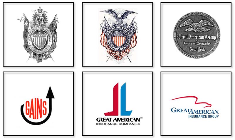
Companies need to evolve to stay relevant – and so do their logos. Many companies are identified by their logo faster than they are by their name.
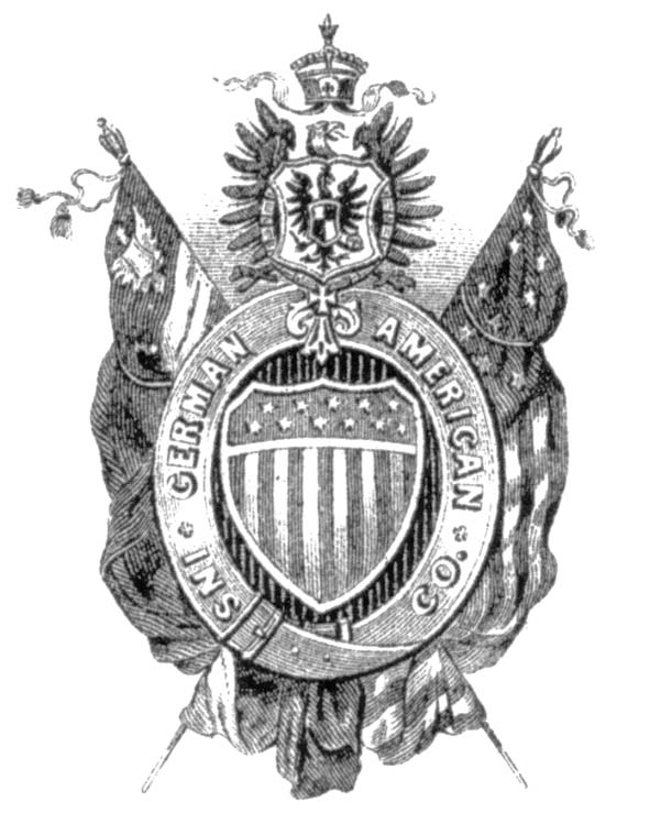
The eagle is a common symbol in logo designs because it is universally considered a positive symbol, associated with freedom, power and resilience. The initial use of an eagle in the company’s logo dates back to our German origins. Founded in 1872 by a number of businessmen with strong German roots, the original images representing the company incorporated both the German imperial eagle – the double-headed eagle – and the single-headed German royal eagle.
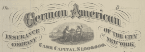
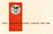
German American received a copyright on this image in 1874. You can see the double-headed eagle on the shield of the woman on the left.
This particular image is most commonly found on late 19th century company documents. This picture is captured from the top of a policy issued by German American.
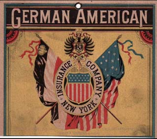
Our first marketing logo, referred to as the “Coat of Arms” logo, had both a German flag and an American Flag. The single-headed German royal eagle, used on the imperial coat of arms of the German Empire from 1871 until 1918, is incorporated into this logo. You can see the single-headed bird with its beak, tongue and talons. While it was not consistently used on all company communications, this logo can be seen on some of the earliest artifacts that we hold in our Corporate Archive.
The full color version of the logo appears on early marketing materials, such as calendars.
In 1918, the company changed its name from German American Insurance to Great American Insurance as a result of the anti-German sentiment in the United States during World War I.
While keeping the same format, the company changed the logo by removing the German flag and replacing the German royal eagle with the American bald eagle.
In the 1930s, a new logo emerged with greater focus on the eagle itself.
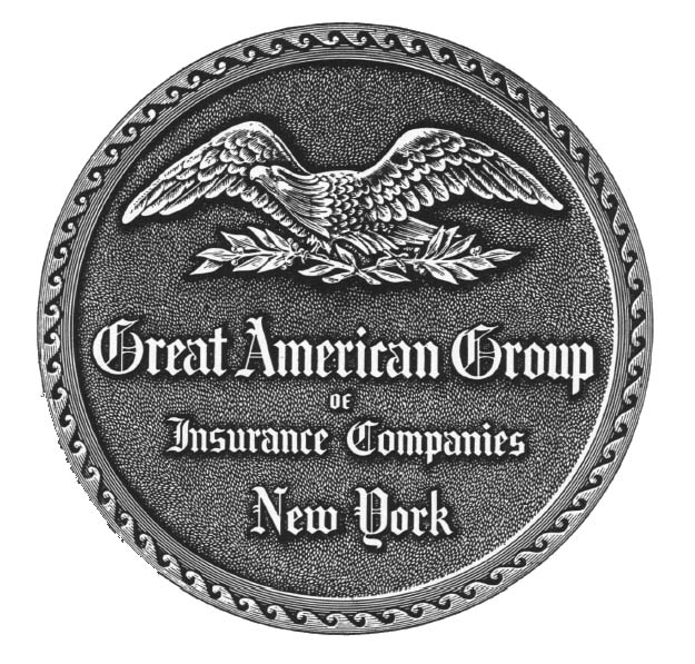
Throughout the 1950s and 1960s, this eagle logo appears in marketing pieces and on company annual reports. It is typically seen on either a blue or red background.
At the start of the 1960s, more attention was being paid to the company’s logo. In 1964, a secondary logo was developed to launch the GAINS Sales Program. Using the acronym GAINS, for Great American INSurance, the company announced that this new symbol would identify all future sales promotional literature of the Great American Group of Insurance Companies.
As the company celebrated its centennial in 1972, it adopted a new logo, known by many as our “boots” logo. In a company newsletter of the time, this logo was described as a “new non-literal interpretation of the company’s 100-year-old eagle.” Marketing Vice President William J. ‘Spike’ Bragg noted that for more than a decade, company logos were becoming increasingly important. Management felt that the old eagle was not consistently used and could be confused with other companies who also used an eagle. They also thought the GAINS logo further splintered their identity.
The company hired an outside firm to design a series of potential new logos, including some that did not include the eagle. The Corporate Identity team voted and opted to maintain the eagle, but with a more modern flair. The copyrighted typeface used for the name was especially designed for Great American. Bragg described the new logo as a “futuristic Great American eagle…its sturdy stylized body and the ribbon effect of its poised wing is catching the public eye as few others can. And that, after all, is just what it is meant to do.”
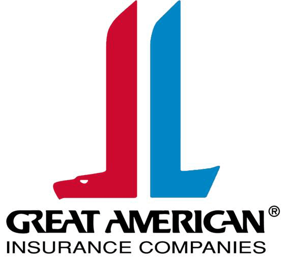
Great American revisited the corporate identity in the late 1990s. At the time, many executives considered the “boots” logo to be dated. Few recognized it as an eagle. In February 1999, the company announced the new corporate identity and logo and introduced the “swoosh” eagle. By 2003, everything was rebranded with the “eagle swoosh” that we continue to use today.
Interested in seeing how Great American grew into the company it is today? Visit our Company Story to see why our yesterdays tell an important story about our tomorrow.